@b.flow8
b.flow888@gmail.com
(+31) 6 4466 5551
(+82) 10 4848 4108
EDUCATION
Culture and Liveral Arts
Korea National Open University, Seoul, Korea
Graphic Design
Royal Academy of Art in the Hague
EXPERIENCE
Exchange at Seoul National University
Seoul, South Korea
EuroFabrique Design Camp
Chaumont, France
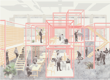
WORK
Design assistance
Elite forum, Seoul, Korea
English teacher
Sieun academy, Prime academy, Seoul, Korea
International corporation consultant
LG U+ International Development Dept.
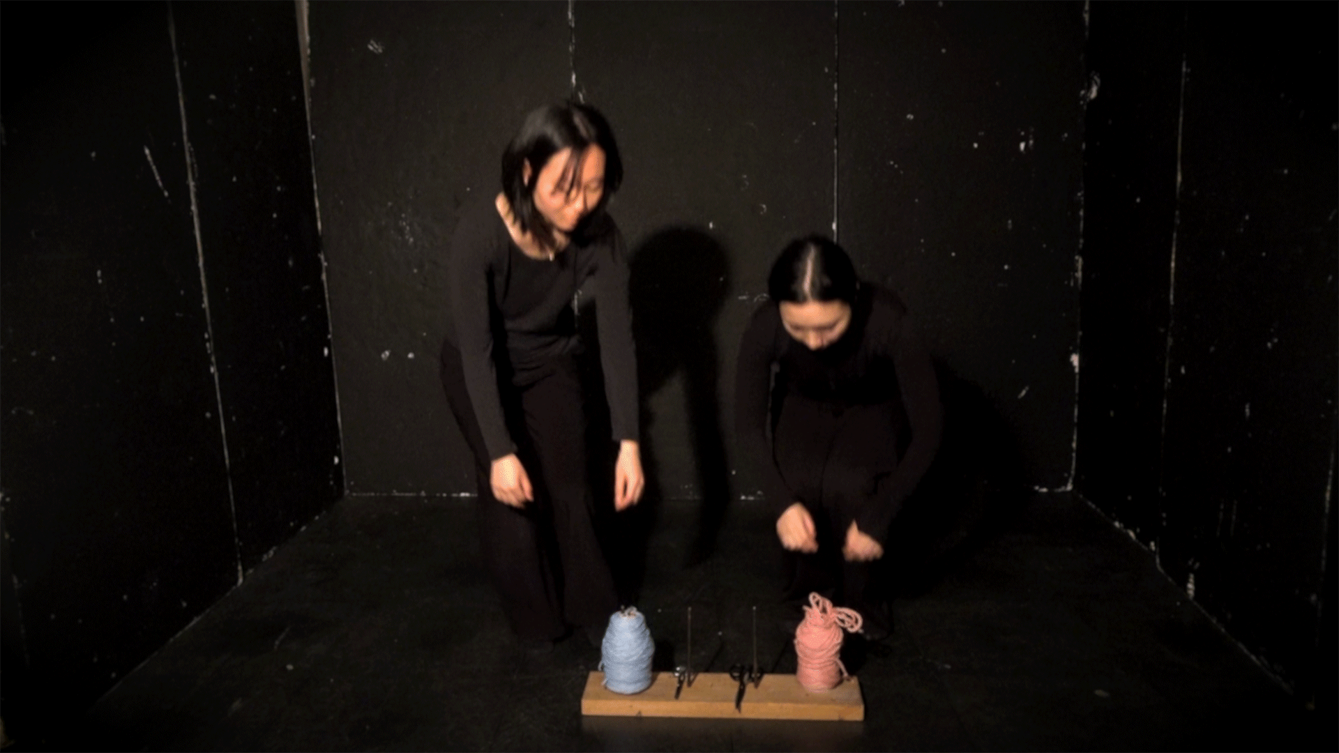
EXHIBITION
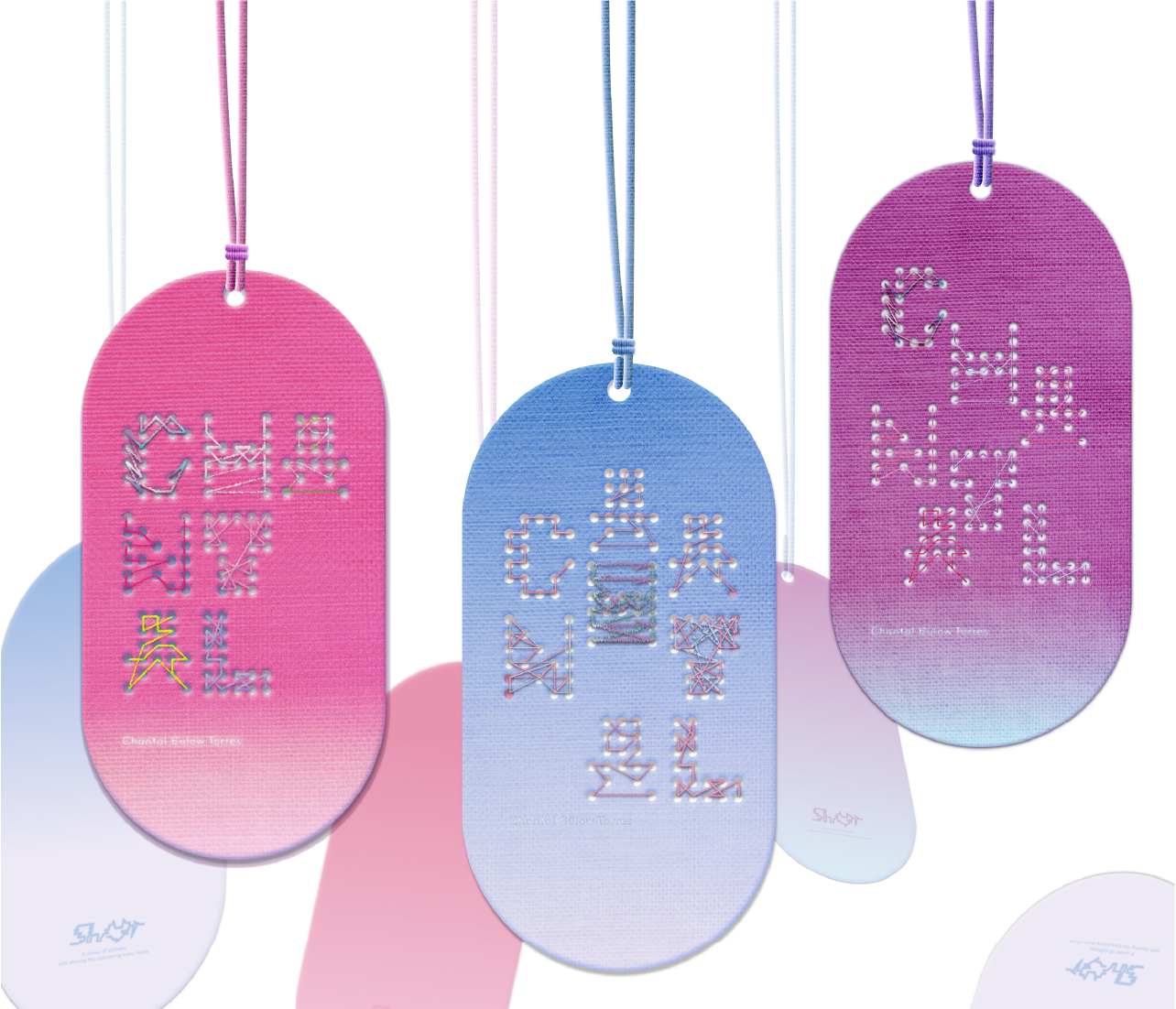
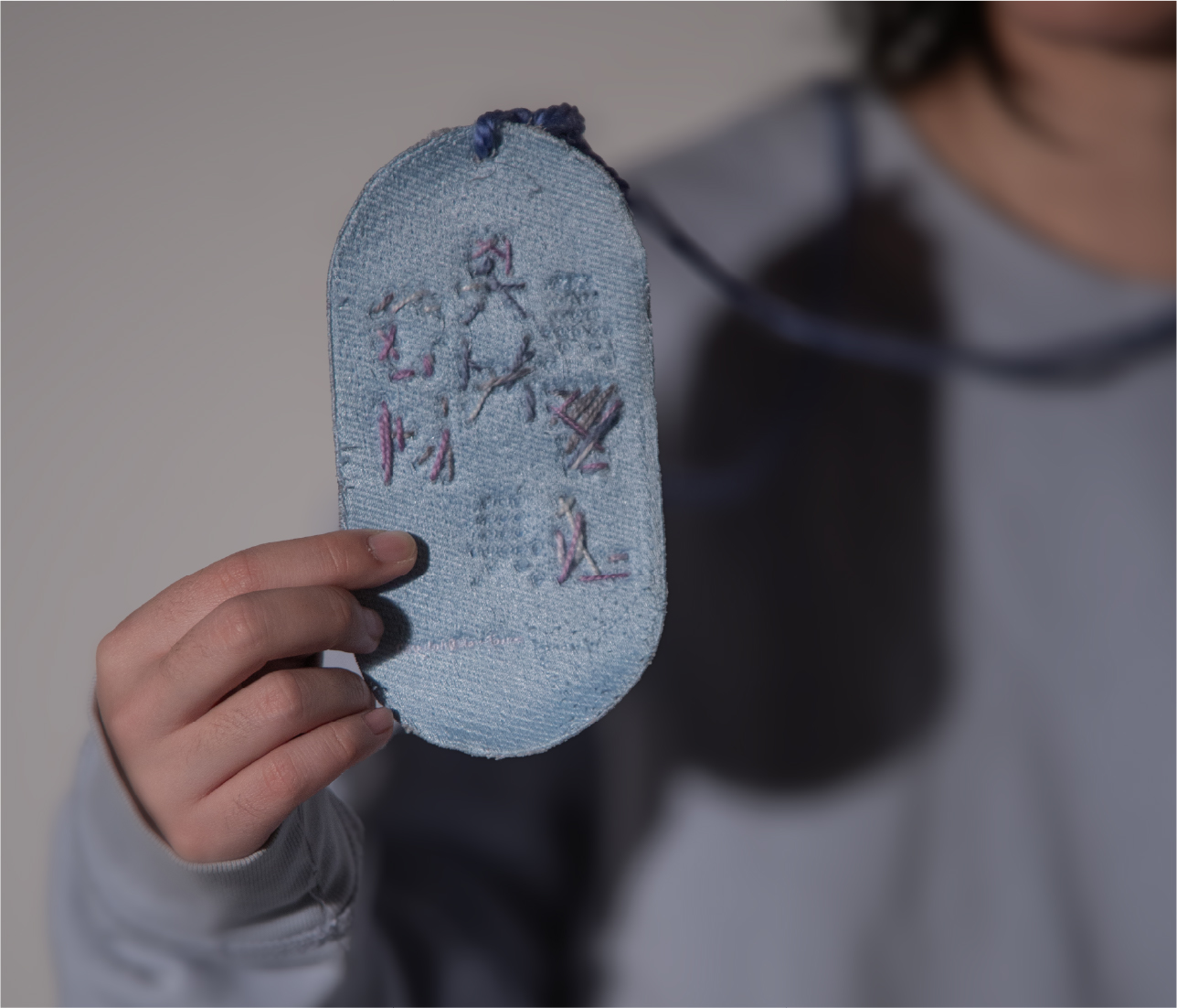
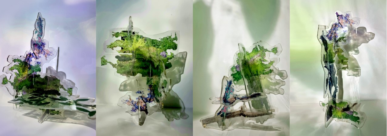
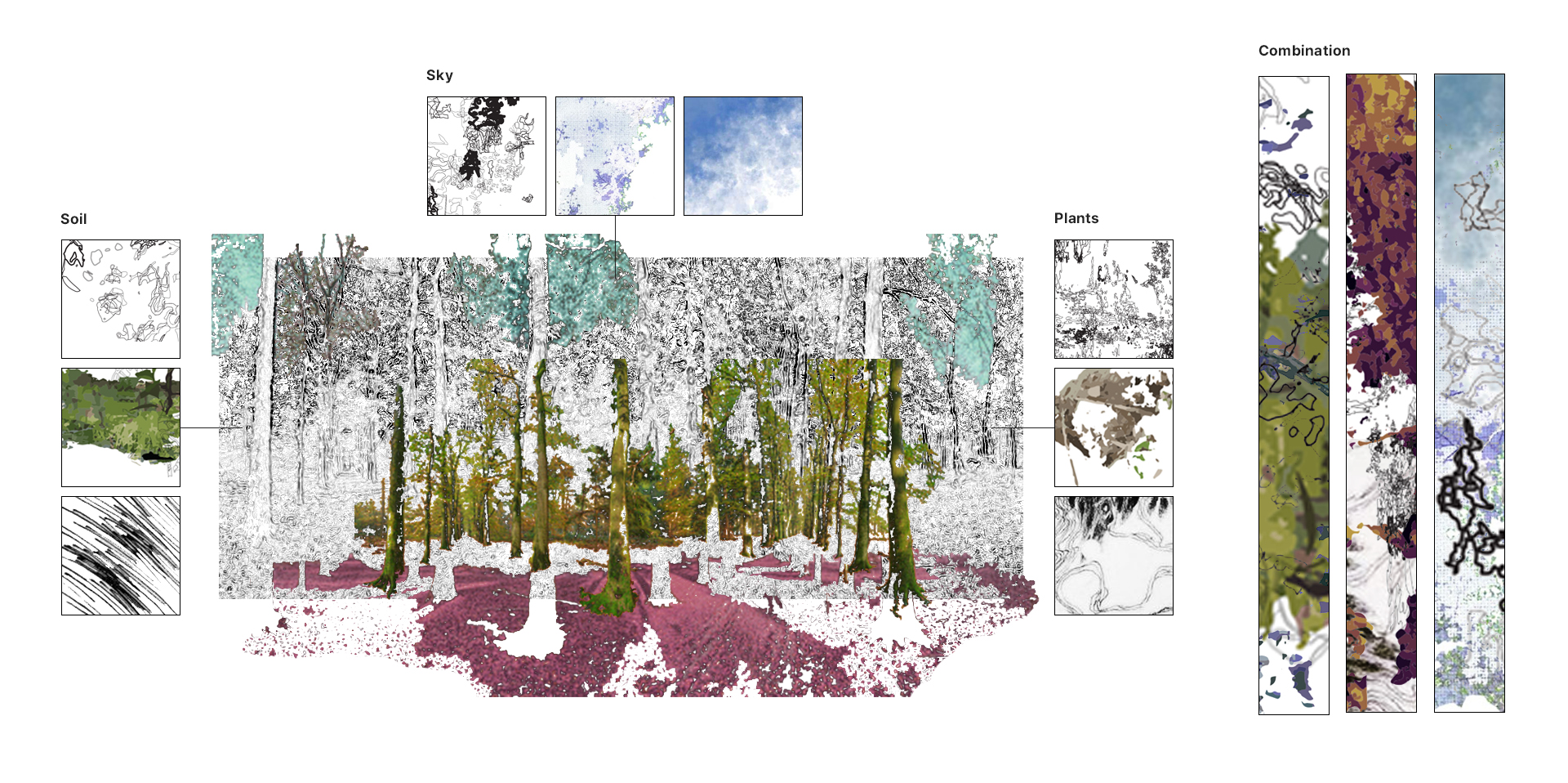
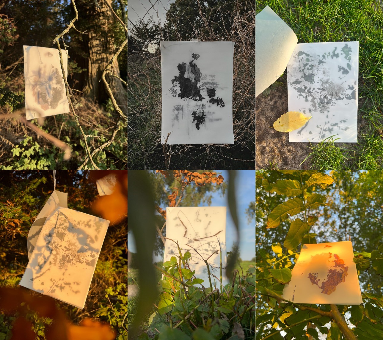
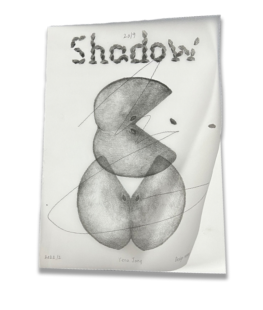
Garden of Love
Grey space, The Hague The Netherlands
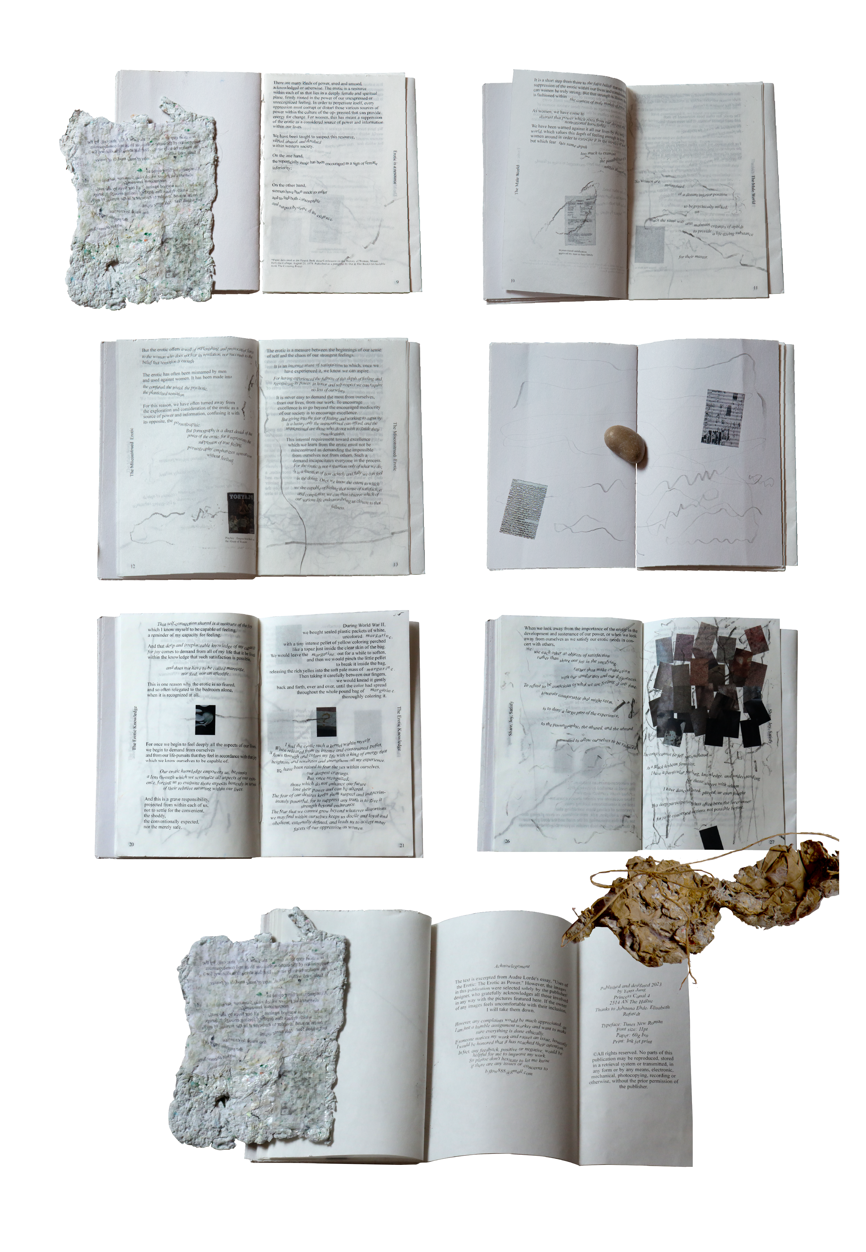
Karen Brodine
Prinsessegracht 4, The Hague The Netherlands
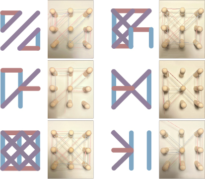
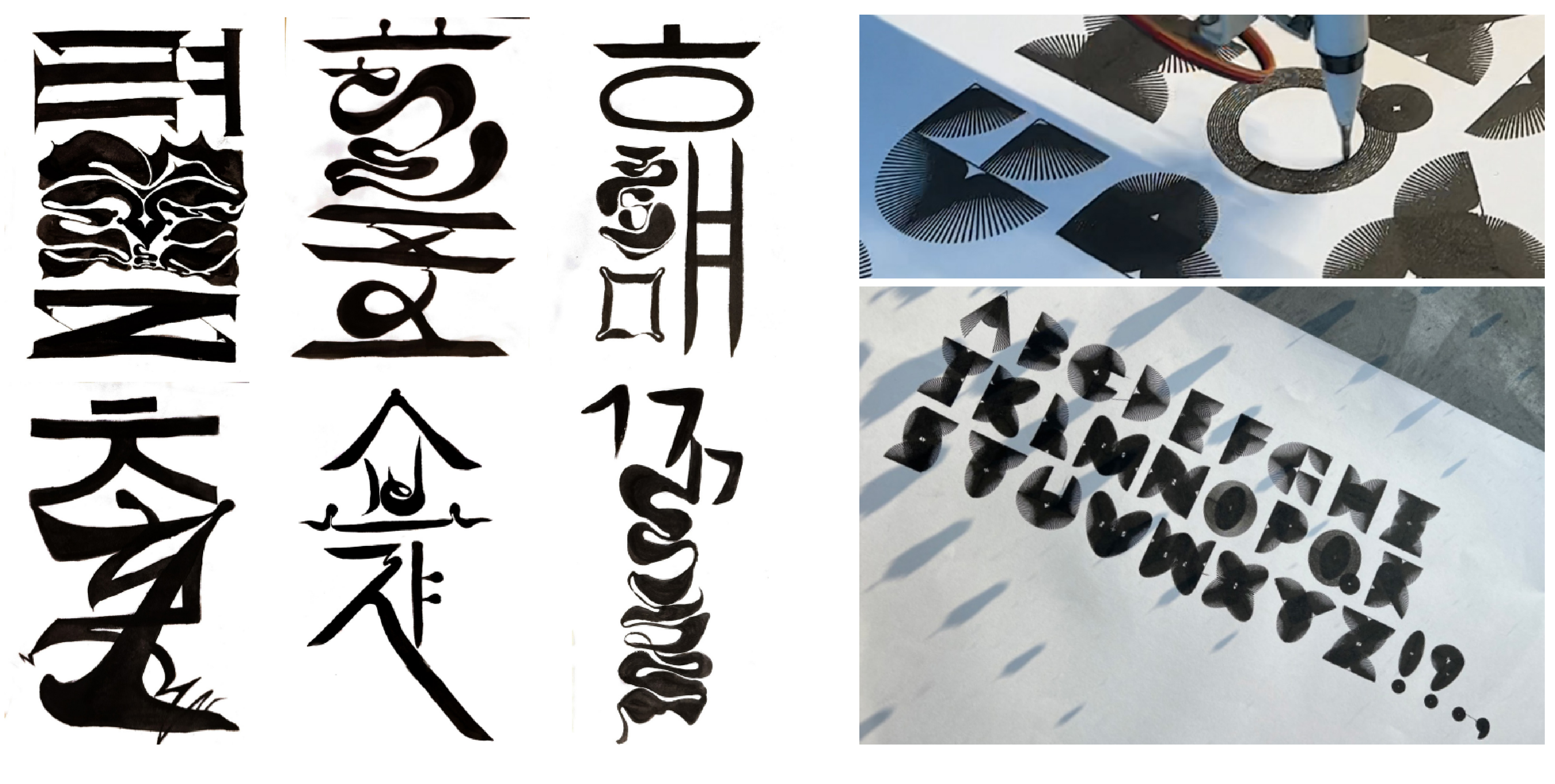
Women typography
Grey space, The Hague The Netherlands
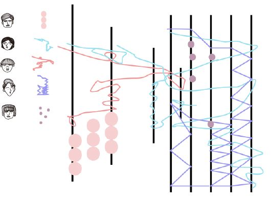
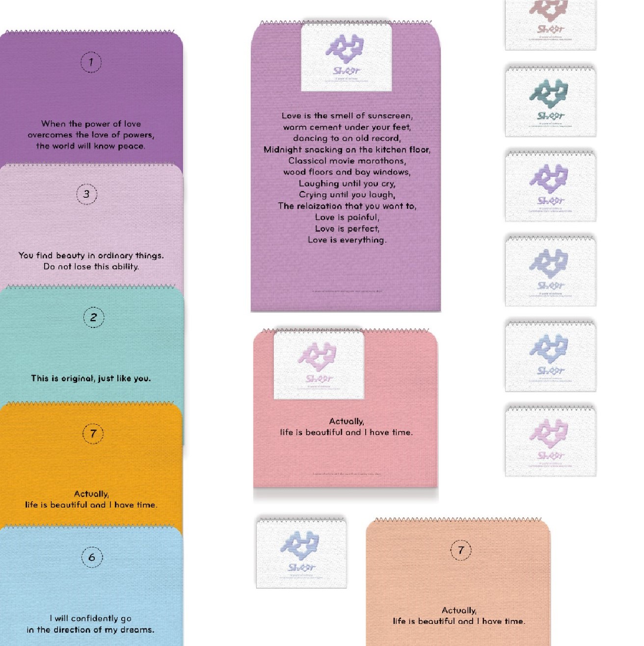
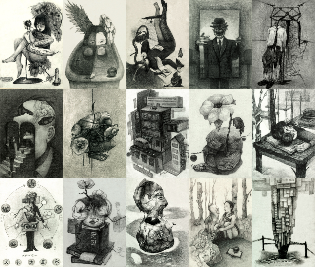
Hello, I am Jang Yena, a graphic designer from Korea.
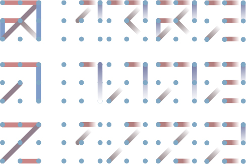
When you
connect the dots of a person's past and present, you can see the line
that connects their past passions and how they have led to the
present.
Also, by extending this line of past and present into
the future, I would like to share
what kind of future you can
expect when working with me.